Conveying Information Customers Need: Product Labeling Requirements
Your product label is one of the best messaging tools for you to connect with your customers. There’s a lot of information on that little bit of space, and you want to maximize that message! But what are the product labeling requirements? What information do you need to include? It’s essential to figure out what…

Entice Your Customers with 4 Delicious Elements of Good Coffee Label Design
There’s nothing like freshly roasted coffee beans. The smell is invigorating—just begging customers to get out their grinder and brew the beans into a fresh cup. If you’re a coffee bean roaster, you probably know that coffee label design is crucial to the look and feel of your packaging. But how can you be sure that…
What Are Custom Die Cut Product Labels?
Your product labeling directly reflects your product and business identity. From food labels to beer bottle labels, a great custom label gives an unmistakable identity to the consumables within. If you want your product to stand out from the crowd, professional die-cut label printing is the way to go. You need professional, polished labels made for your product….

Sauce Label Design: 4 Ways to Make Your Special Sauce Stand Out!
You’ve worked hard to develop your special sauce. Perhaps it’s a recipe passed down through your family or a product you’ve arrived at through much trial and error. When you’re ready to take your secret sauce to the masses, the right sauce label design makes all the difference. There’s a big world out there when…

Sustainable Labeling: How to Choose Greener Labels
These days, consumers and many manufacturers are realizing the merits of going green. Not only are eco-friendlier packaging options good for the planet, but they’re good for your reputation and your bottom line. In a recent Consumer Brands/Ipsos poll, 84% of respondents said they were concerned about waste from plastics and packaging. Recycling is at the forefront of their minds,…
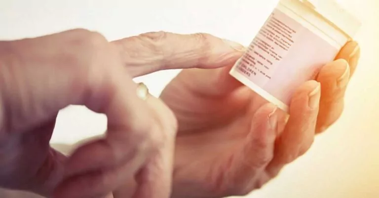
Deciphering Common Medical Device Labeling Symbols
If you work in any area of the medical industry, you likely have some familiarity with medical device labeling symbols. You’ve probably seen the images on everything from pill bottles to medical equipment. But do you ever wonder why we use symbols in the medical industry? They almost seem like hieroglyphics or a coded message….